How We Developed Our Brand Photography

A brand identity is not a one-and-done thing for your business. It is something that constantly develops and grows as you dig yourself deeper and deeper into who you are as a business.
When we started mediaUP, we knew how important brand photography is for a visual identity. We really wanted a photography style that stood out and really pushed our aesthetic.
As we developed, so did mediaUP’s brand.
Here is our journey of what we did to turn our brand photography into what it is today and made it our most important element in our visual identity system.
Beginning Stages
When we first started, our vision was simple.
We wanted corporate clients so we needed a "corporate: aesthetic. But different.
We already had a general idea of what kind of photos we wanted. We decided on going with a street photography style (because that was the style I was most familiar with at the time) by taking photos of ‘corporate stuff in downtown Toronto’ with a serious looking edit on the photos.
This was an okay start. It was pretty on the nose and surface level. It more complimented the overall brand aesthetic rather than to tell its own story.
Different but forgettable. No real substance
More Colour More Life
As we moved away from the "corporate" feel, we wanted to bring more life to the brand to get away from the serious and gritty look. We started to move away from the street photography style and do a more stylized and realistic edit.
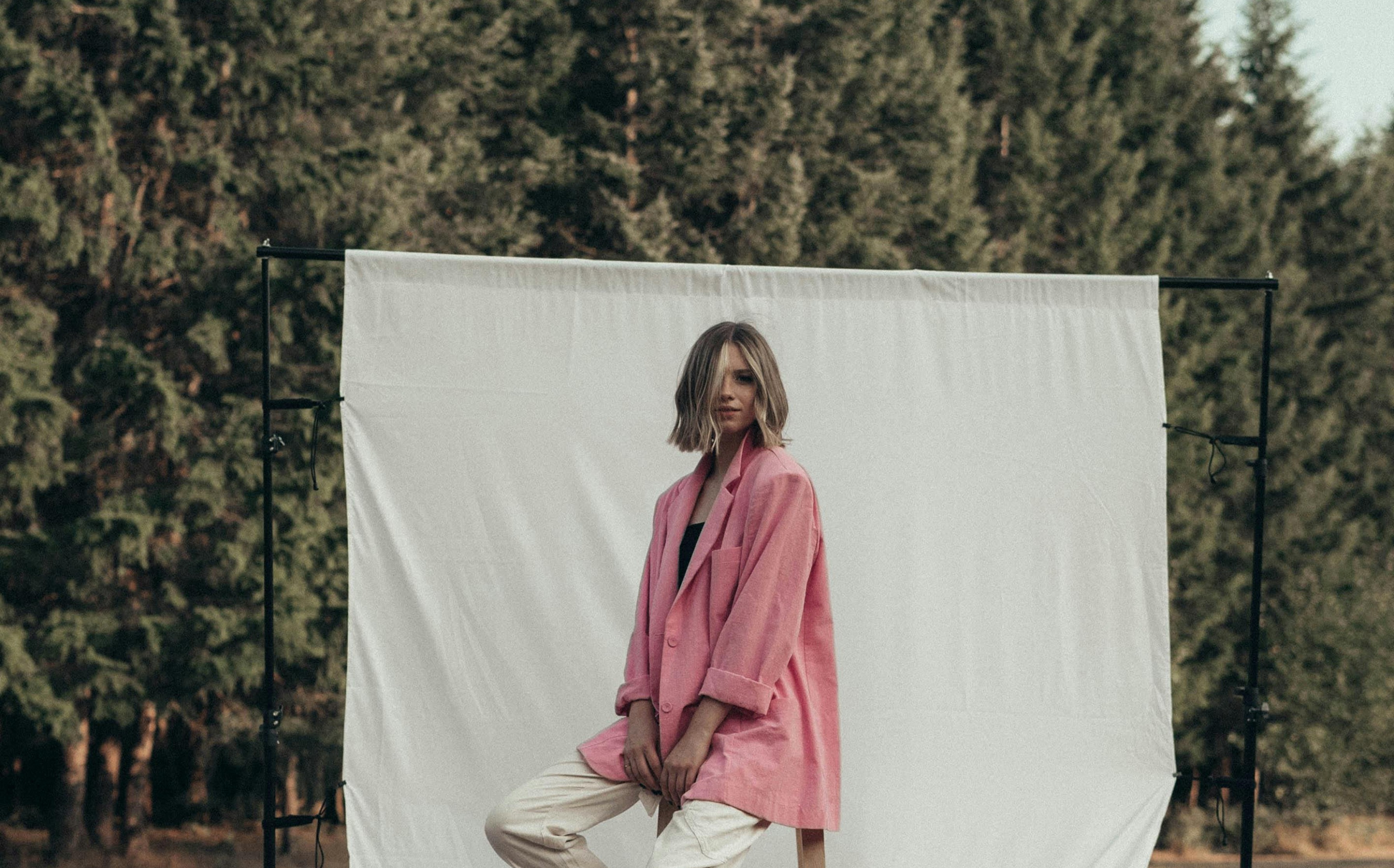
Though these photos looked good and the aesthetic started to align with mediaUP’s brand, it still lacked from having a meaning behind it as well as it didn't have much consistency. It began to look like a random selection of photos with no real through-line to tie it to our brand.
Ya it looked better but still lacked any real substance to the brand.
Back To The Roots
At this point, we knew we needed more consistency and needed more “why” to our brand photography. So we decided to go back to our roots with our old street photography style but this time with more consistency and more of a story.
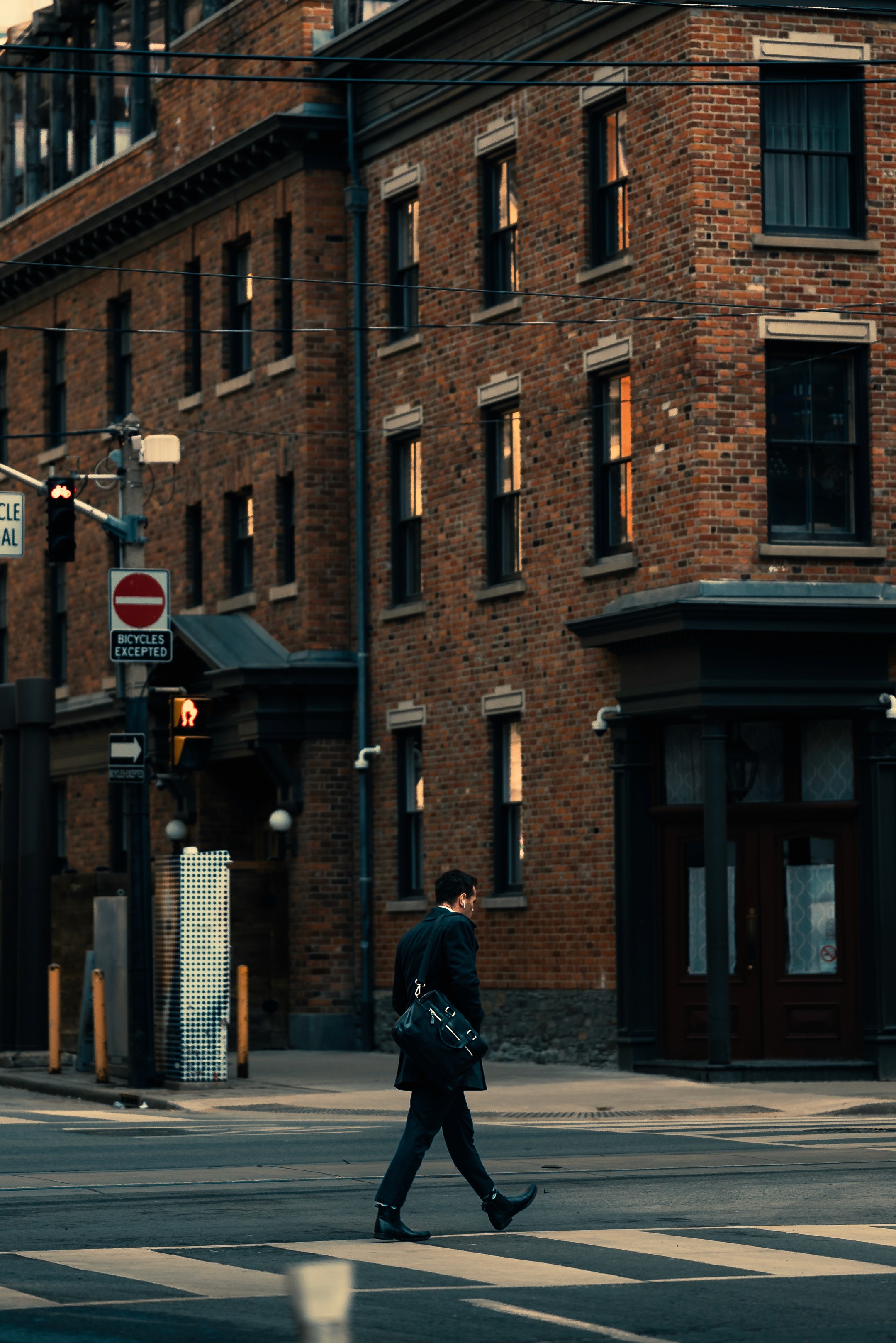
After some work we came up with our brand photography philosophy which was “Putting a focus on what you may see during your commute in downtown Toronto”.
This was better but still lacked a strong identity.
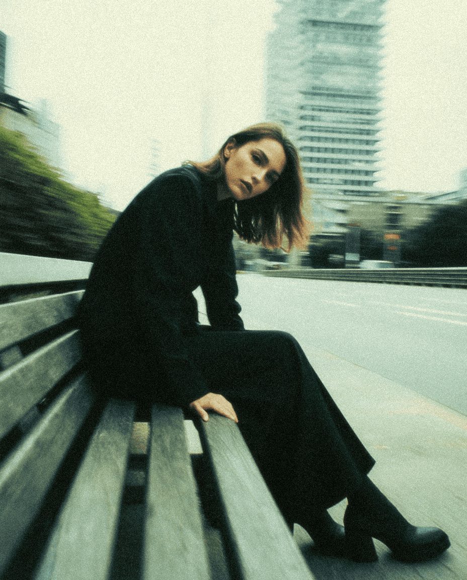
Finally, Hitting The Mark - With Story
At this point we knew we had decent brand photography but still lacked any real substance that really helped drive our brand properly .
We need more substance and meaning.
We wanted to move into something that was even more stylized, less realistic and a lot more repeatable. Something that really pushed our brand identity hard and had a strong message behind it.
After a lot of brainstorming, what we came up with is the brand photography you see today.
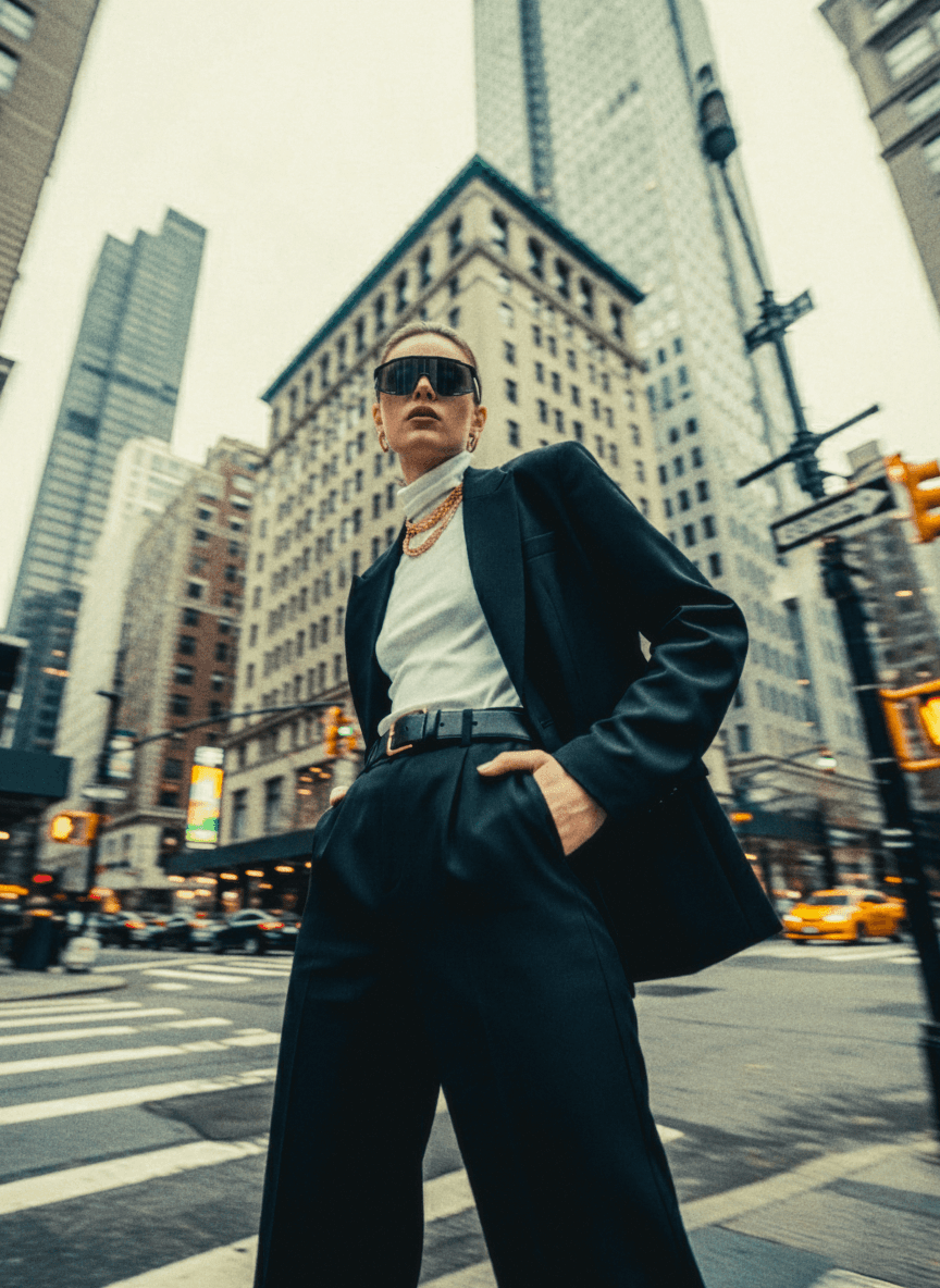
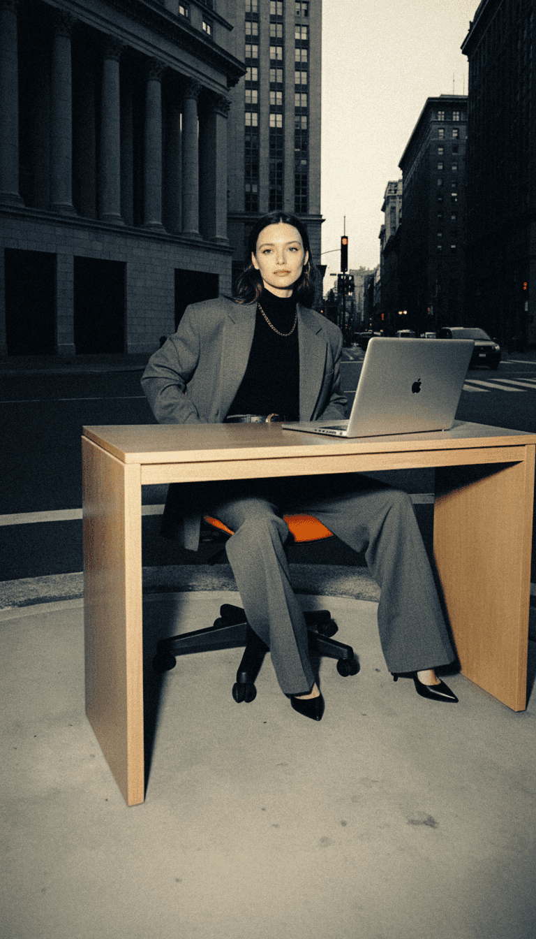
The story for our photography is “a laid back approach to corporate business”. This is shown through the models wearing suits or “corporate clothes” but the laid back comes from the jewelry or accessory while also being in an unconventional places but still being in a city.
Then we also have made a standardized edit on each photo. Typically this is a deep blue on the shadows with a yellowish green colour in the highlights while also adding a good amount of grain.
This new style gave a more repeatable and consistent style that allows us to have a more recognizable aesthetic:
Model wearing a suit or “corporate clothes”
Model wearing flashy jewelry - like a gold chain or sunglasses
The model is posing in a corporate setting - either in an aesthetic corporate office or on the streets of downtown.
Using grain
Adding slight motion blur to give texture
This new system for our brand photography allows us to have a repeatable designs that really push and fit our strong brand messaging.
At this point we are really happy with how our brand photography looks. But we always know that our brand is a constantly developing thing that we are always looking to improve.
Brand Matters.